3.3 XAML & Code Behind

01. 목표
XAML & Code Behind 연동
C# WPF 는 XMAL 파일과 C# 파일이 한쌍을 이룹니다.
XAML에서 대부분의 UI 작업이 가능하지만, 로직은 Code Behind에서 구현해야 합니다.
우선, XAML 디자이너에서 정의한 컨트롤을 C# 코드에서 식별하고 호출하는 방법을 익혀봅시다.
02. 예제 준비
02.1 Calculator 예제를 다운받고 XAML 확인합니다.
(새 프로젝트를 만들고, 아래 XAML 태그를 추가해도 됩니다.)
<!--Height="525" Width="350"--> <Grid Margin="10"> <Grid.ColumnDefinitions> <ColumnDefinition Width="*"/> <ColumnDefinition Width="*"/> <ColumnDefinition Width="*"/> <ColumnDefinition Width="*"/> </Grid.ColumnDefinitions> <Grid.RowDefinitions> <RowDefinition Height="2*"/> <RowDefinition Height="*"/> <RowDefinition Height="*"/> <RowDefinition Height="*"/> <RowDefinition Height="*"/> <RowDefinition Height="*"/> </Grid.RowDefinitions> <Label Content="0" HorizontalAlignment="Right" VerticalAlignment="Bottom" FontSize="60" Grid.ColumnSpan="4"/> <Button x:Name="acButton" Content="AC" Margin="5" Grid.Row="1"/> <Button x:Name="negativeButton" Content="+/1" Margin="5" Grid.Row="1" Grid.Column="1"/> <Button x:Name="percentageButton" Content="%" Margin="5" Grid.Row="1" Grid.Column="2"/> <Button x:Name="divisionButton" Content="/" Margin="5" Grid.Row="1" Grid.Column="3"/> <Button x:Name="sevenButton" Content="7" Margin="5" Grid.Row="2"/> <Button x:Name="eightButton" Content="8" Margin="5" Grid.Row="2" Grid.Column="1"/> <Button x:Name="nineButton" Content="9" Margin="5" Grid.Row="2" Grid.Column="2"/> <Button x:Name="multiplicationButton" Content="*" Margin="5" Grid.Row="2" Grid.Column="3"/> <Button x:Name="fourButton" Content="4" Margin="5" Grid.Row="3"/> <Button x:Name="fiveButton" Content="5" Margin="5" Grid.Row="3" Grid.Column="1"/> <Button x:Name="sixButton" Content="6" Margin="5" Grid.Row="3" Grid.Column="2"/> <Button x:Name="minusButton" Content="-" Margin="5" Grid.Row="3" Grid.Column="3"/> <Button x:Name="oneButton" Content="1" Margin="5" Grid.Row="4"/> <Button x:Name="twoButton" Content="2" Margin="5" Grid.Row="4" Grid.Column="1"/> <Button x:Name="threeButton" Content="3" Margin="5" Grid.Row="4" Grid.Column="2"/> <Button x:Name="plusButton" Content="+" Margin="5" Grid.Row="4" Grid.Column="3"/> <Button x:Name="zeroButton" Content="0" Margin="5" Grid.Row="5" Grid.ColumnSpan="2"/> <Button x:Name="pointButton" Content="." Margin="5" Grid.Row="5" Grid.Column="2"/> <Button x:Name="equalButton" Content="=" Margin="5" Grid.Row="5" Grid.Column="3"/> </Grid>
02.2 레이블 Content 속성 확인
프로젝트를 실행 전, XAML resultLabel 객체의 Content 속성 값이 0으로 정의되어 있음을 확인합니다.
프로젝트 실행시, 레이블에 숫자 0이 출력됨을 확인할 수 있습니다.
03. 컨트롤 식별자 지정
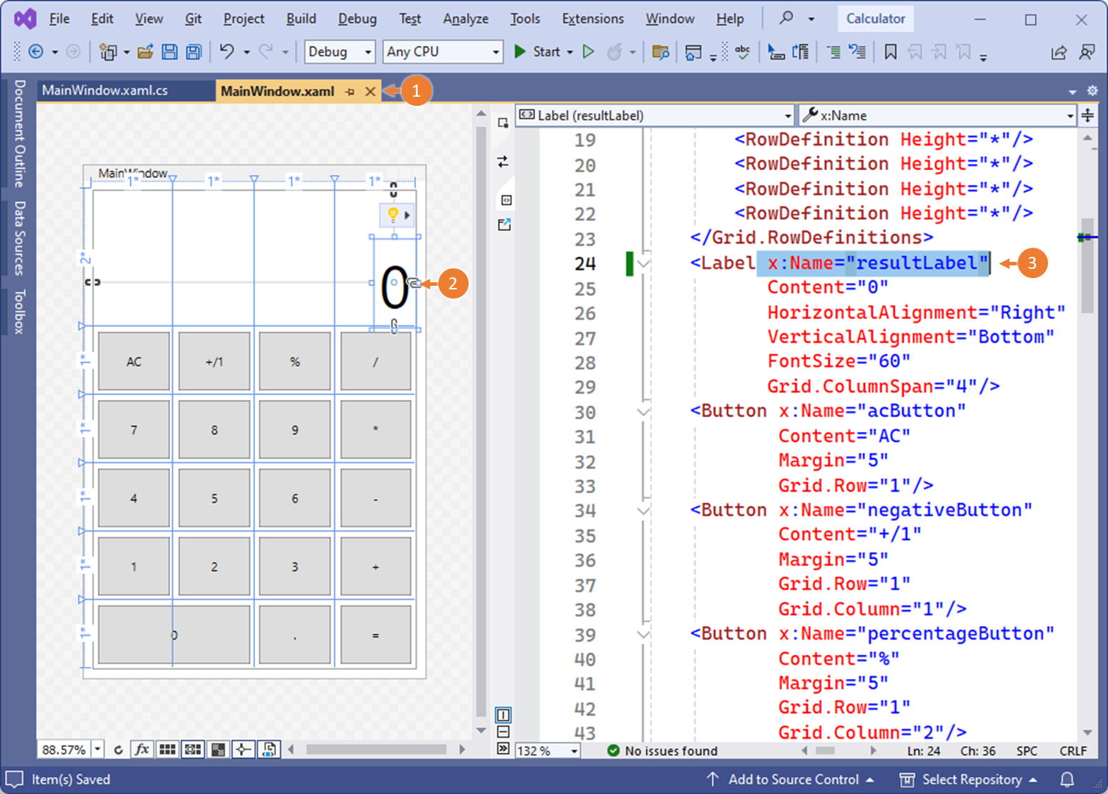
MainWindow.xaml의 XAML 소스에 레이블 컨트롤은 유일하게 1개가 존재합니다.
레이블 컨트롤 코드를 찾아, 해당 레이블을 식별할 수 있는 x:Name 속성을 추가합니다.
x:Name 속성은 레이블을 식별하는 객체의 이름이 됩니다.
x:Name="resultLabel"
04. 코드에서 컨트롤 로직 구현 - Label
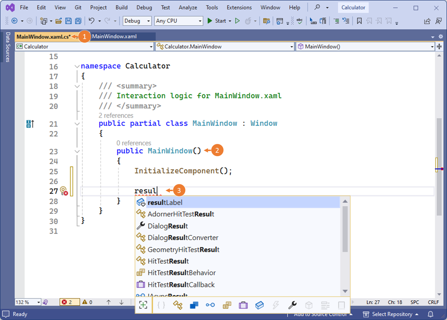
① MainWindows.xaml의 Code Behind로 이동합니다.
③ 컨트롤의 x:Name 속성의 값(resultLabel)으로, Code Behind에서 참조할 수 있습니다.
XAML에 정의된 레이블 컨트롤의 콘텐츠 속성을 Code Behind에서 수정 작업합니다.
이 작업은 XAML 디자이너의 XAML 태그에서 Content 속성을 추가하는 것과 동일한 결과를 만들어 냅니다.
아래 두 경우를 비교하여, XAML 소스와, C# 코드가 한쌍을 이루고, 동일한 작업을 할 수 있다는 것을 이해합니다.
@ XAML 소스에서 작업할 경우
<Label Content = "12345" />
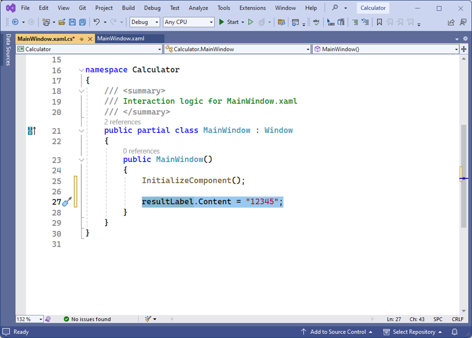
@ Code Behind(C# 소스 코드)에서 작업할 경우
resultLabel.Content = "12345";
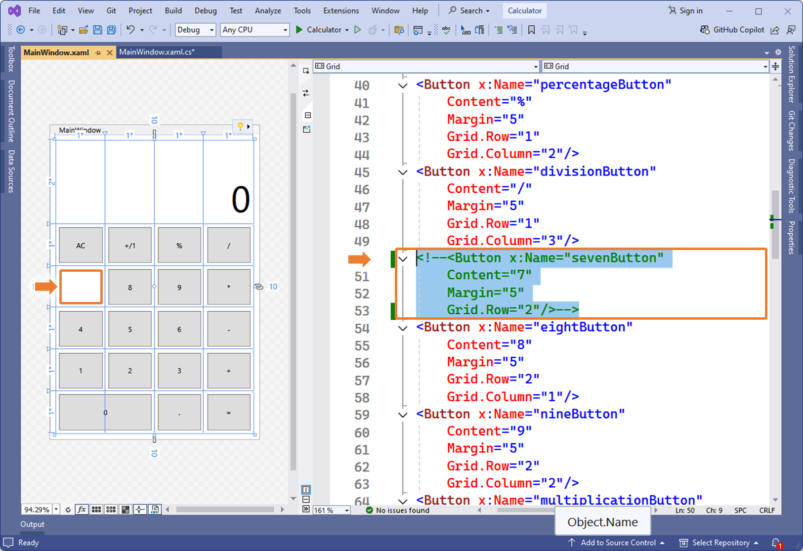
05. 코드에서 컨트롤 로직 구현 - Grid
05.1
05.2
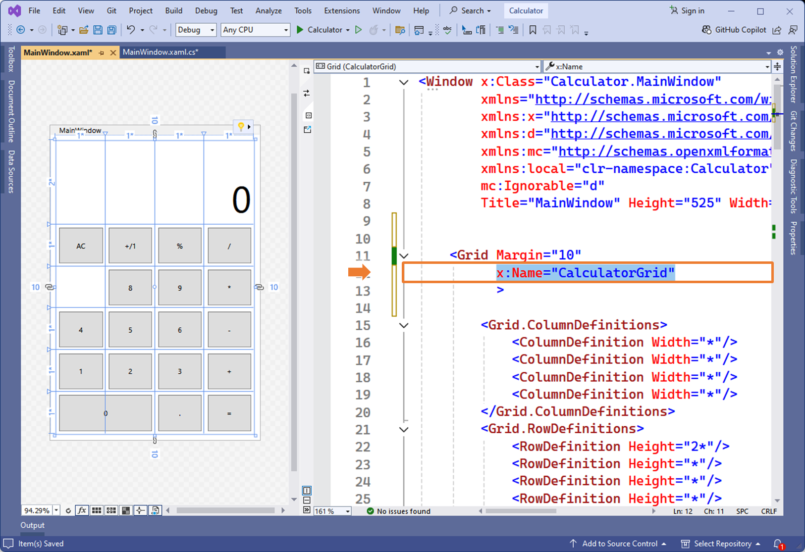
x:Name="CalculatorGrid"
05.3
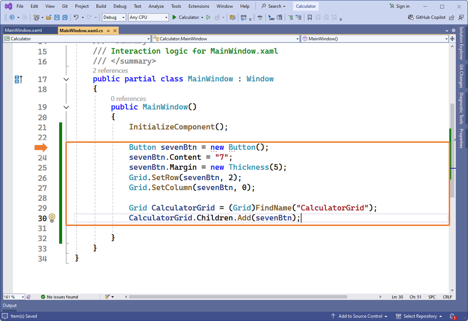
Button sevenBtn = new Button(); sevenBtn.Content = "7"; sevenBtn.Margin = new Thickness(5); Grid.SetRow(sevenBtn, 2); Grid.SetColumn(sevenBtn, 0); Grid CalculatorGrid = (Grid)FindName("CalculatorGrid"); CalculatorGrid.Children.Add(sevenBtn);
05.4
실행하면, 주석하기 전 XAML 코드와 동일한 UI 를 확인 할 수 있다.
06. 조금 더 살펴봅시다.
06.1 XAML 소스의 x:Class 를 확인해봅시다.
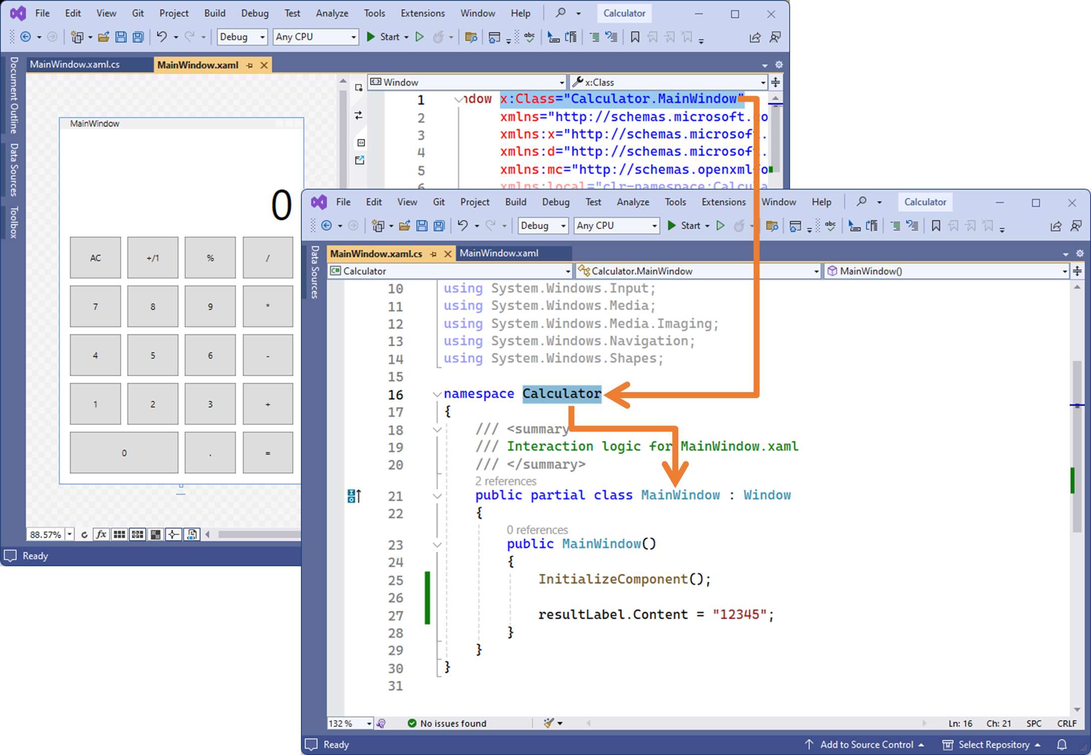
XAML 파일의 태그 최상단에 x:Class로 Calculator 네임스페이스의 Mainwindow 클래스가 정의된 것을 확인할 수 있습니다.
06.2 MainWindows.g.i.cs 를 확인해봅시다.
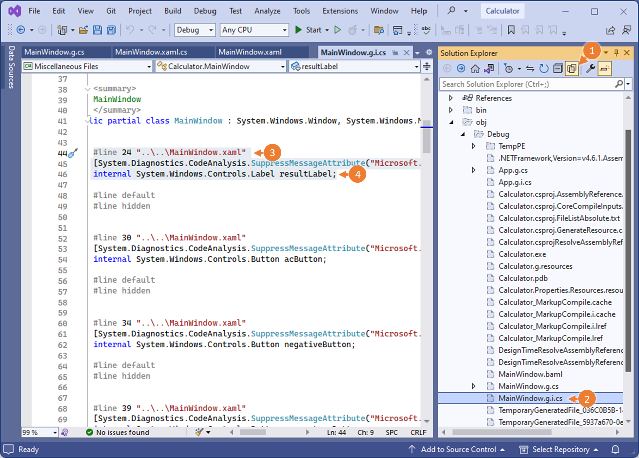
g.i.cs (generated by intellisense.C#)
빌드 후 실행하면, XAML 기반으로 자동 생성된 C# 소스 코드 파일을 확인 할 수 있습니다.
솔루션 탐색기의 ① 모든 파일 보기 버튼을 클릭하면, 프로젝트에 포함된 모든 파일이 보입니다.
자동완성된 파일 중 ② obj > Debug > MainWindows.i.g.cs 파일을 확인해봅시다.
MainWindows.xaml.cs 의 partial class 입니다.
내부에 XAML에서 작업했던 UI 컨트롤에 해당하는 C# 소스 코드가 자동 완성되어 있음을 확인 할 수 있습니다.
③ #line 24는 MainWindows.xaml 소스의 XAML 위치에 해당합니다.
④ x:Name="resultLabel" 에 해당하는 정의도 자동으로 구현되어 있음을 확인할 수 있습니다.
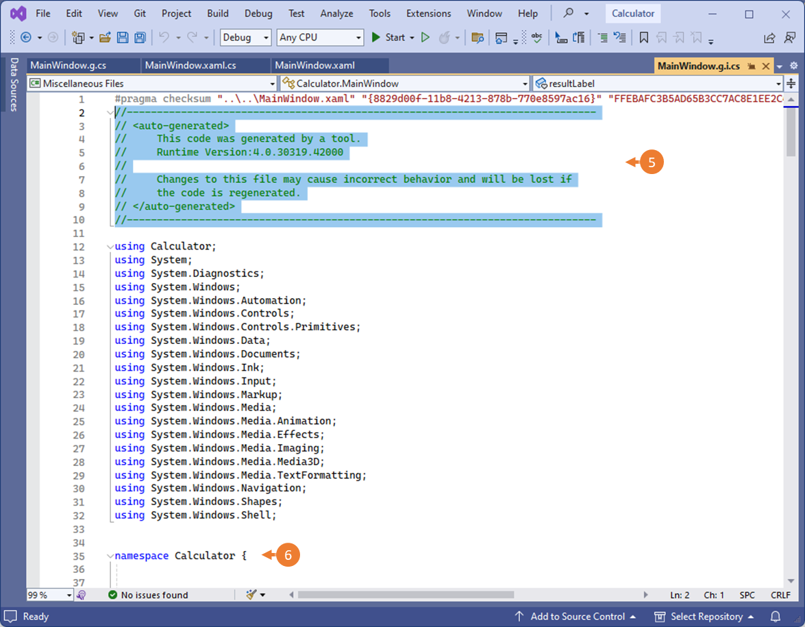
⑤ 상단의 주석에는 MainWindows.g.i.cs 파일이 자동 구현되었으며, 수정하지 말 것을 알려주고 있습니다.
⑥ 네임스페이스는 프로젝트 Calculator 입니다.
07. 실행결과 확인
07.1
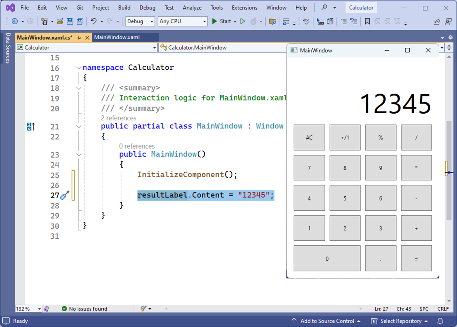
프로젝트를 실행하여 결과를 확인합니다.
Calculator 프로젝트의 MainWindow 클래스의 생성자에서 레이블 컨트롤의 Content 속성 변경을 구현했기 때문에 MainWindow Class가 실행될 때, 생성자 내부의 명령문이 실행되어
resultLabel.Contents = "12345";XAML에 정의된 resultLabel의 Contents 속성 값이 구현됩니다.
07.2
위와 같이, 모든 XAML UI 컨트롤은, x:Name 속성의 이름을 정의하면,
C# 코드 비하인드에서 참조하여 비즈니스 로직을 구현할 수 있습니다.
레이블 이외에 다른 컨트롤을 C# 소스 코드에서 참조하여 로직을 구현해 봅니다.
댓글을 사용할 수 없습니다.